Shopping Cart for the Visually Impaired by Alessandro Fabiani & Marco Sidoli
- Studerende
-
- Uddannelsesniveau
- Kandidat
- Fagområde
- Industrielt design
- Fokusområde
- Design for People
- År
- 2022
- Uddannelses projekttype
- Kursus
About the project
How might we enhance the independence of visually impaired people in their daily grocery experience?
Our answer: “Intervening in the design of the shopping cart by expandingitsuse and fruition.”
The first step was to get in touch with associations and with blind or visuallyimpaired persons. We decided to diversify the modes of interaction. We visited the BLINNDNESS ARBEJDE store in Aarhus owned by blind people. Through some contacts in Italy we met Nicla, a visually impaired girl with whom we established a strong relationship. And the use of social networks allowed us to reach out and interview Jan and Soren, visually impaired and blind.
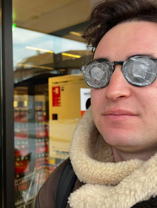
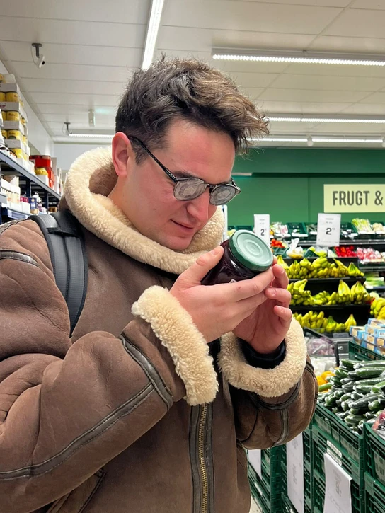
The outcomes that emerged from these early interviews made us comprehend the daily lives of visually impaired people, and shed light on the common difficulty in grocery shopping. To get into the shoes of the users, we used probes as a tools to investigate the grocery experience first-hand with visual impairment. We created a series of questions that we sent to Nicla for her to answer while buying groceries. With some of this data we realised that she never uses the big trolley because she is unable to perceive the space and even with the small one she still doesn’t go near the wine and beer shelves for the fear of bumping into them.
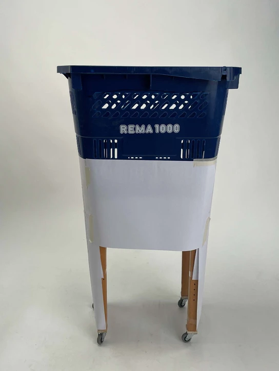
To investigate the data from the probes evenf urther, we did a double Grocery Experience to understand the common pain points between unimpaired and visually impaired people. Through this experience we found that the common need to improve the interaction with the shopping cart go through the height of the shopping cart, the depth of the trolley and leaving the shopping cart to go pick the goods on shelves. To understand how the shopping cart was born and changed over the years, we conducted a thorough desktop research where we extrapolated the anchor points of the project, like the handle on the perimeter, raising the height, easy interaction and 360 wheels. Through these Anchor Points we started sketching new shapes and new way to interact with the shopping cart.
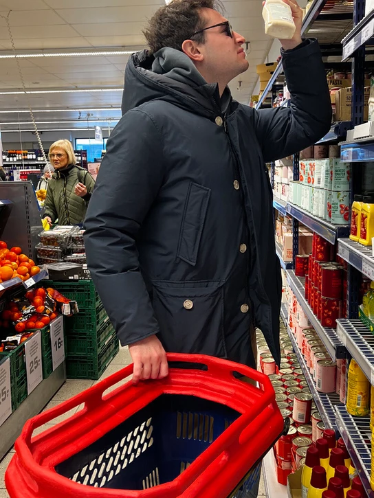
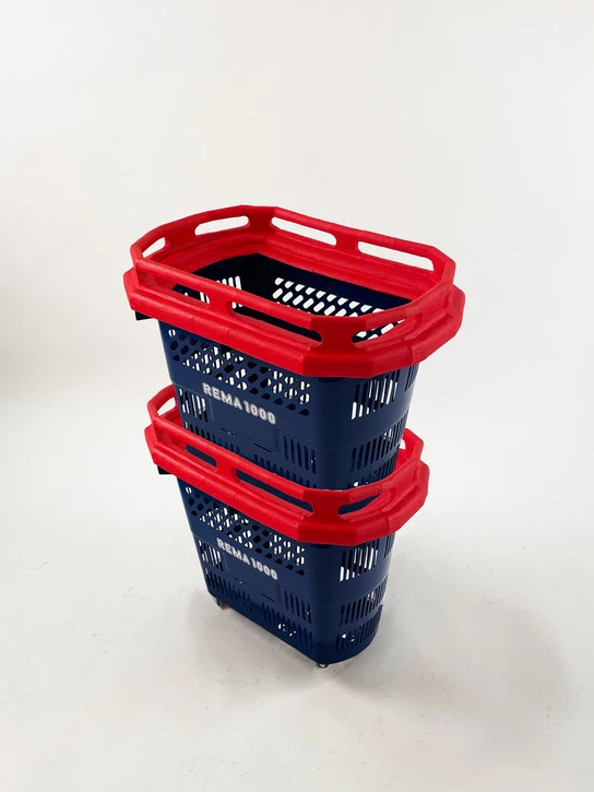
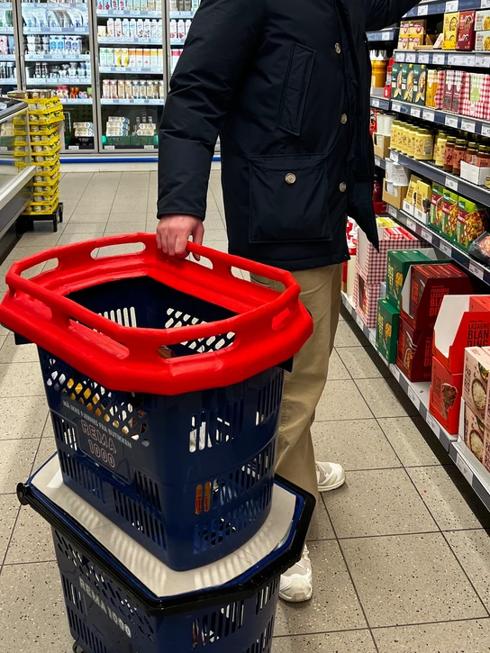
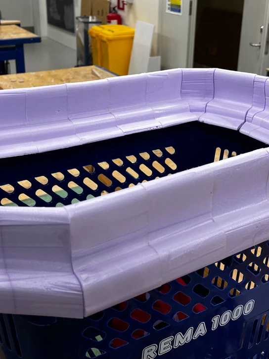
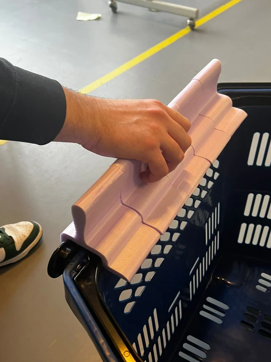
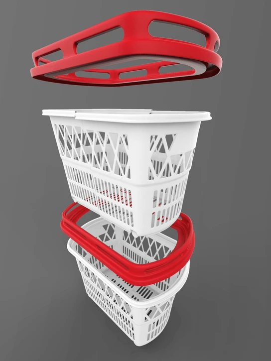
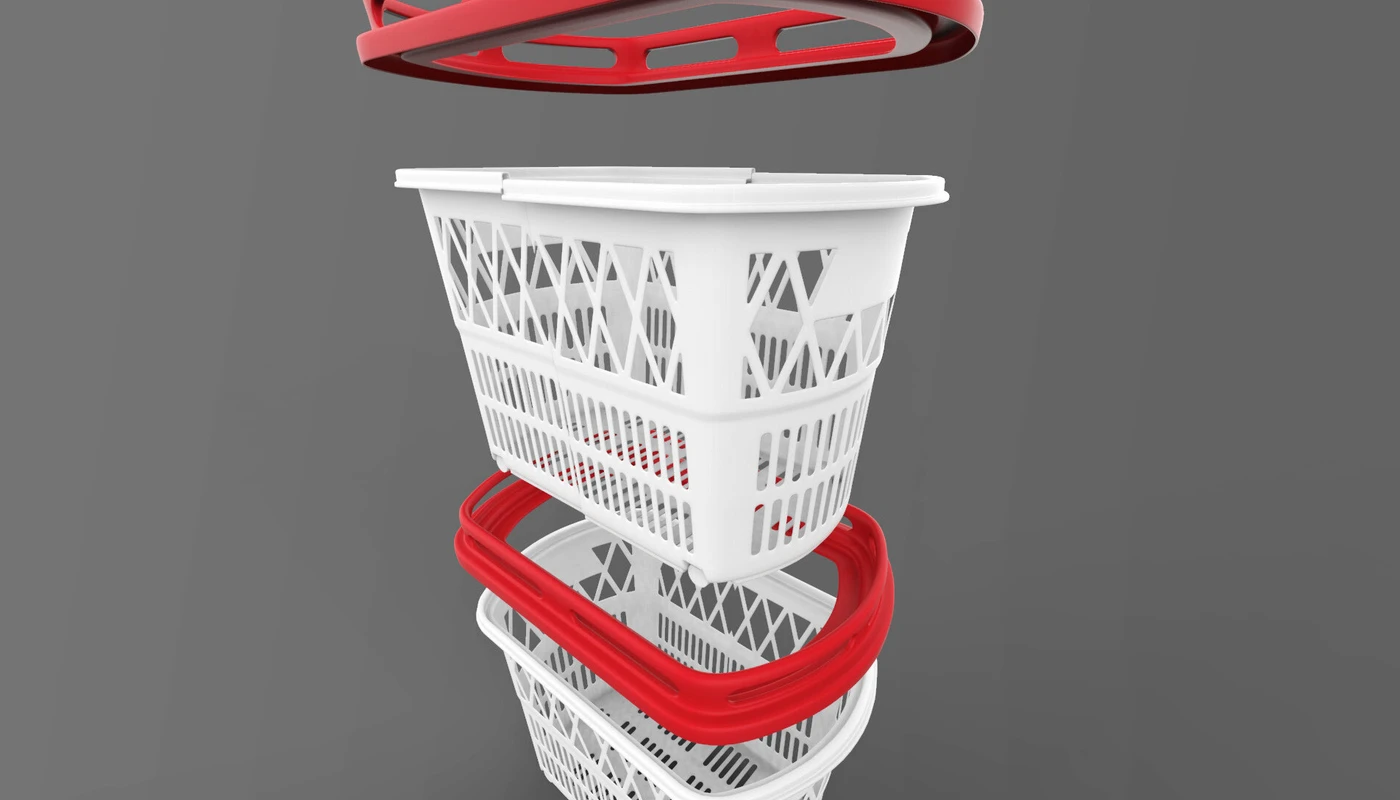
Designing a full scale prototype helped us understand which user experience was better and led us to one specific solution. We went deeper into the design of a Handle that could be implemented in the already existing shopping cart. We studied the ergonomics and color of this device, that with a non-invasive approach, transforms the classic shopping cart into a morefunctional product. We decided to replicate the grocery experience and learnt that the shopping cart is used as a foothold to get oriented in the supermarket, the two red handles help to understand the depth and having a handle around the perimeter helps to move the trolley easily.
Our aim with this project was born with the ambition of connecting social design to the industry, so we started out by analyzing a specific target audience and then designing a product that is usable by everyone. The industry strength of this project is in adding just one object and minimizing the material, making it easily scalable.
