Exploring an experimental and material-based colour design practice
- Ph.d. studerende
-
Maria Høgh-Mikkelsen
- Hovedvejleder
- Eva Brandt, Claus Peder Pedersen
- Samarbejdspartnere
- Funded by Independent Research Fund Denmark
- Eksterne links
- Elsevierpure
About
‘Chromatic atmosphere’ is recently suggested as an alternative approach, which acknowledges the material's influence on the perception of colour, but refrains from suggesting specific design methods.
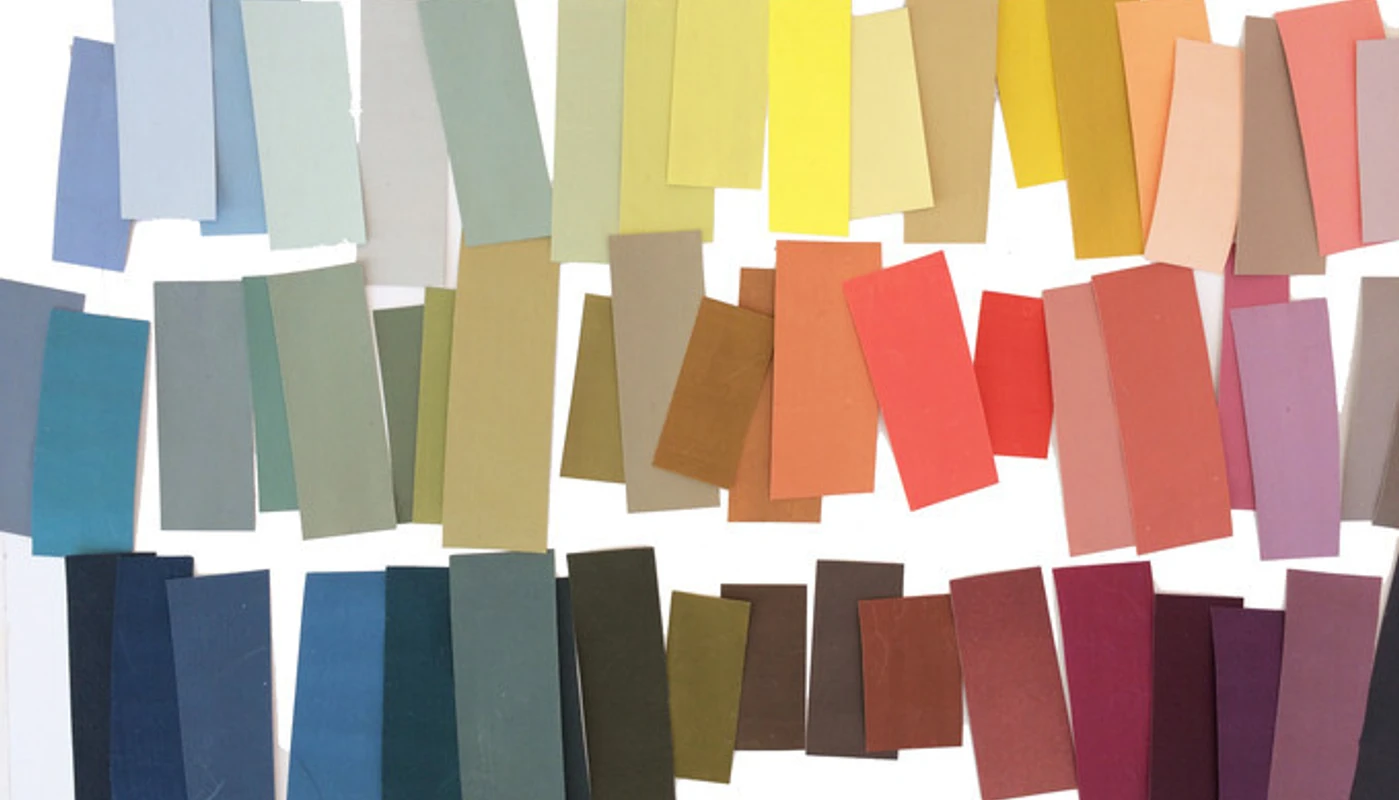
This project investigates how elements from the two concepts can form the basis for development of an experimental and material-based colour design practice and a contemporary colour terminology using harmony and atmospheres as perspectives to analyse and discuss designed colour combinations.
Research questions
Q1: How may an experimental and material-based approach to colour design be developed and described to support a contemporary design practice and design education?
Q2: How may elements from the theories of colour harmony and the theory of atmosphere form the basis for a contemporary colour terminology, that can be used to discuss and critically reflect on colour combinations?
Methodology
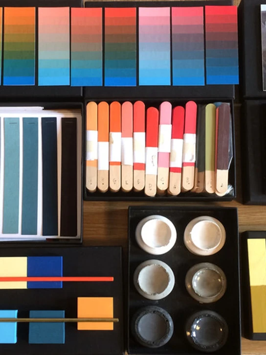
In line with this position, Maria Høgh-Mikkelsen applies the research methodology ‘Practice-based Design Research’ as a means to study with colour. Mikkelsen is an experienced colour designer and lecturer and draws on both skill sets in the creation of empirical data.
The research design is planned as three iterations of experimentations that constitute the project’s production of empirical data. Each iteration is based upon Donald Schön’s three types of experiments; Exploratory Experiments, Move-testing Experiments and Hypothesis Testing Experiments.
To make the research questions operational, Mikkelsen has divided the terms experimental and material-based into four themes for experiments:
- Personal Colour (intuitive - as opposed to a dogmatic approach and quest for harmony)
- Colour Narrative (the colour designer as the narrator of atmospheres)
- Material Colour (colour embedded in a material and material’s influence on colour perception)
- Spacial Colour (colour on form and form’s influence on colour perception)
The experiments are conducted at Kolding School of Design by Mikkelsen and BA students in the colour course at the 2nd semester.
In the analyses, Mikkelsen describes the produced colour combinations from the perspective of the ideal colour harmony in visual diagrams by using concepts from authoritative systems such as complementary contrasts, value, triads, etc.
To describe the experienced atmosphere, she applies phenomenological writing about the produced colour combinations from an experiential point of view and in relation to theory of atmosphere.
Furthermore, she reflects on the experimental and material-based colour design methods in two steps: Firstly, by describing the applied methods and compare them to instructions from authoritative colour systems such as Itten, Chevreul, Ostwald. Secondly, by discussing the experimental and material-based colour design methods with a board of professional colour designers to reflect on the relevance of these methods in a contemporary design practise.

Expected results
The research will also propose concrete tools to support the product designer in colour design processes as well as propose new methods for teaching colour in design education.
The project’s use of design experiments as investigative procedure will contribute to the development of international design research, particularly in ‘Practice-based Design Research’.
